This is the first post in a visualization remake series. In each episode, I plan to cover motivations for the technique, share what I made and learned, and list other places where you can see this technique in context. The purpose of the remake is to build my knowledge, and not to critique the original design.
Ben Jones @DataRemixed is a wonderful source of visualization inspiration. Last week he shared a Tableau piece that he produced for his Data Visualization class at the University of Washington.
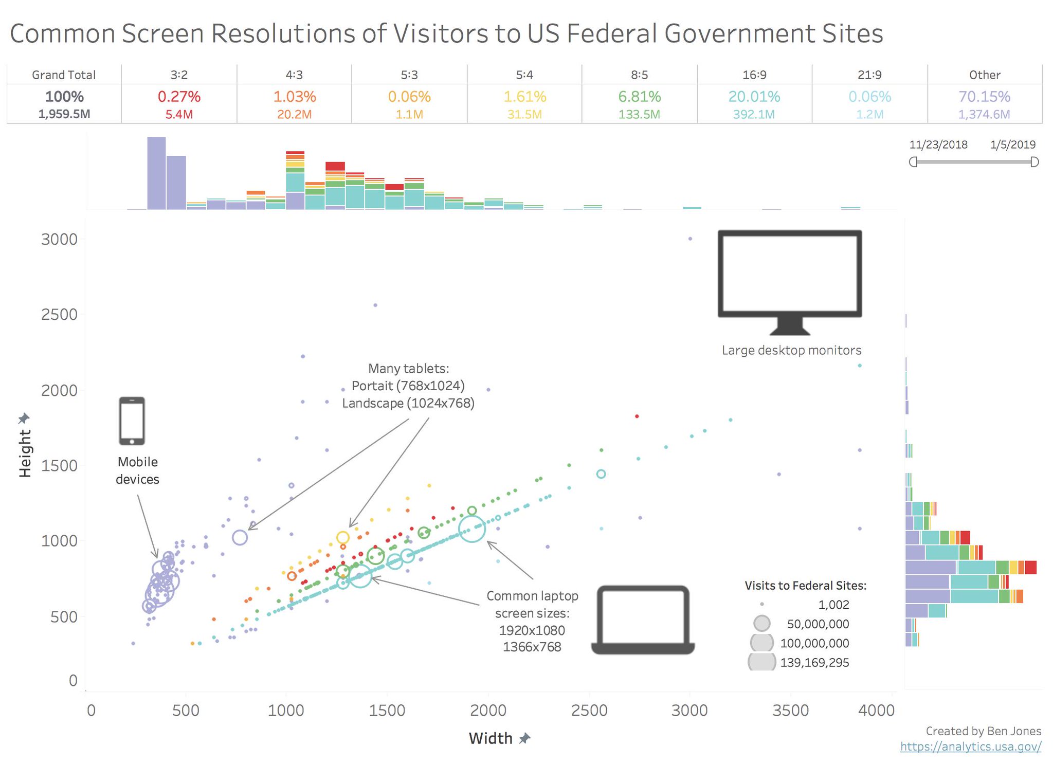
While there are multiple reasons why I found this piece engaging, I’ll focus on the marginal histograms. These are the rainbow “bar charts” along the X and Y axes. While I have made single marginal histograms for timeseries charts, I had yet to apply this technique to scatterplots. It is a good design to launch this series of chart remakes.
Where Do Marginal Histograms Come From?
Although the pieces of the marginal histogram chart are not unusual on their own (it’s just a histogram next to a scatterplot), the combination is not yet mainstream. This may change if Microsoft adds them to the builtin Excel options. Until then, you may have to add explanatory text if you include Marginal Histograms in a report.
Marginal Histograms are a specific type of small multiple. They share the property of being able to use reuse 1 axis for multiple charts at once, as well as the ability to easily compare values by horizontally or vertically scanning your eyes between charts. One could claim that the margin charts are unnecessarily redundant, because all the information in the histograms could be extracted from the central chart. However, while the scatterplot emphasizes individual data points, the histograms helps the viewer understand the big picture patterns.
If someone needs to understand a dataset at both macro and micro levels, this is very useful. From an information density perspective, the Marginal Histogram technique uses much less space than making 3 separate charts which aren’t aligned in this way. If your audience is unfamiliar with scatterplots, it may make sense to present each of the 3 charts individually before showing them combined.
Marginal histograms have a close cousin, the rug plot. Rugplots visualize just 1 dimension, but are helpful when you don’t have enough marginal space to draw the full bars.
Remaking Marginal Histograms
Yesterday, Elijah Meeks and Susie Lu released new documentation for Semiotic. Semiotic is a javascript library I’ve been itching to use more, and this remake seemed like a good way to learn the library.

Things I added
- Load ~6 weeks of live data instead of working with a static data extract. In other words, the data will change daily. In the event that the live data ends up breaking the app, I’ve saved a data extract.
- Custom tooltip (text on hover), reveals the visitor count
- D3 color palette
- “Colored Rays” - (h/t Amelia Wattenberger) + colored strokes on qualified points - reduces the amount of eye-jumping needed to understand which points correspond with particular aspect ratios.
Things I left out
Tableau unlocks interactive capabilities very quickly. I decided not to invest time in re-implementing them, so that I could focus on the static part of this design. Including those capabilites would be important if this type of graphic was on a dashboard that received regular views.
- Filtering/cross-highlighting on hover:
- There’s a world of interactions that involve linking the state of the margin charts with the central chart, including cross-brush driven filtering, cross-highlighting (as Ben’s visual already does), and cross-panning.
- Histograms with Stacked Bars
- I found the aspect ratio information interesting, but I wasn’t sure what I as a user (web developer or a website visitor) would do with that information. I decided to invest that time in including annotations in stead.
- Legend for point sizes
- SVG graphics of the different device types
What I made
The live demo can be found here, along with an editable sandbox and source code.
This GIF shows a few snapshots of the visual’s evolution. To make it, I took screenshots with the Chrome “Full Page Screenshot” API, used David Yanofsky’s script to stitch my folder of images into a single file, cropped stray pixels with ezgif, and hosted the file on Giphy.
This second GIF captures a few of the checkpoints on my way to placing the aspect ratio rays- before I learned that it was possible to draw them using Semiotic “summary polygons” instead of pure SVG, I was trying out different geometric formulas to scale and rotate my triangles into the right position.
The original demo that the GIF was made for, without the rays, can be found here.
Things to try in the future
Here are ideas for extending the ideas explored in the remake.
- Brush-to-zoom
- I have an abandoned git branch that attempted to use the builtin 1d brushes of both histograms to filter the scatterplot body, as well as to link the brushes to some shared higher component state. Unfortunately, I ran into an issue. The redrawn graphs (after being given new “extent” properties) did not preserve the charts’ original margins. I might re-attempt this feature in another project without a framework.
- Richer tooltips: Reveal sparklines of screen size’s visits versus time in the tooltips
- Brush-driven summary analytics
- Whether the brush comes from the scatterplot or margin chart, calculate the values in the table of Ben’s design to cover using only the points included in the brushed selection
- Given a selected rectangle, indicate what percentage of visits fit inside that rectangle (to estimate impact of particular responsive design projects)
- Buttons to emphasize “points of interest”
- Highlight top 90% of screen sizes for different categories (mobile, laptop, etc)
- Filter graph to include only the screen sizes covered by Apple/Microsoft products
- Device search (personalize the experience)
- Let the user type in a phone / device model, and highlight the screen resolution of that model
- Check the user’s current screen size, and highlight it on the chart,
- Filter chart to only contain the data within range of the current viewer’s screen size
- Figure out a useful way to depict the screen sizes tagged
(0x0)or(other), instead of dropping them - Decide what marginal histograms could mean for a connected scatterplot
NPM Libraries
These are a few of the open source projects that made this chart possible.
Semioticis a visualization library that strikes a balance between the flexibility ofd3and the out-of-the-box friendliness of more restrictive APIs likevictory,nivo, orhighcharts.d3-legendis responsible for the color legend at the bottom, just feed it an existingd3-scale.d3-annotationis my favorite way to add annotation to a web-based chart, and Semiotic ships with support for it. Just supplyeditMode: trueto the annotation objects, and handles will appear that let you drag the markers around. I have a separate tutorial that will let you experience the joy of drag-and-drop positioning your annotations.D3Blackboxenables you to use existing d3 code into a React component without making any changes.RxJS: Normally I just use d3 + Lodash, but have recently been interested in writing declarative code. I’m not sure that I gained much in terms of readability, but it was interesting to make an observable-based data pipeline.
Closing: Marginal Chart Inspiration
Both of these designs experiment with using density curves instead of histograms, which avoids the challenge of picking appropriate bin sizes.
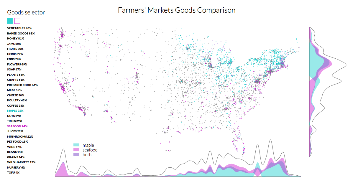 > Farmer’s Market Map - Susie Lu
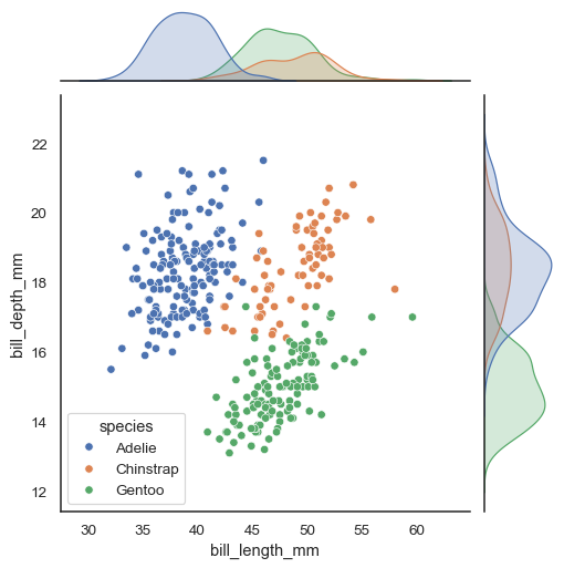 > Seaborn (Python Package): JointPlot - Michael Waskom
seaborn has chart types that gain “rugs” (marginal ticks) if they’re given the right boolean.
Further reading
- Marginal Histograms- Not just for Scatterplots - Steve Wexler
- Using Semiotic if you’ve never used React - If you’re interested in trying Semiotic for the first time, start here! If you get stuck, the
semioticchannel in thed3slack channel is a good source of help. - Design and Redesign in Data Visualization- Fernanda Viégas and Martin Wattenberg’s essay about guidelines surrounding the practice of using remakes to drive the field of visualization forward.
Have you seen a marginal chart that you like? Please let me know about it on twitter.
With thanks to Amelia Wattenberger for feedback on earlier copies of this design, and Elijah Meeks for leading me to discover more Semiotic features
Update
Since this post was released, Elijah added support for marginal graphics (not just histograms) to both Semiotic and Nteract Data Explorer, making visualizing distributions alongside scatterplots easier than ever!