Motivation
What changes someone from consumer to maker of data visualizations?
When seeing visually stunning data projects, people are often impressed, but may be intimidated rather than inspired.
One difference between visualizations that inspire new generations of makers, and visualizations that do not, is perceived accessibility. To have the drive to finish a piece, a person should be able to imagine the road to completion, even if they are not familiar with the details. The difference is the type of “wow”:
- “Wow that’s amazing! I have no idea how it was done, and I’m not going to ask because it’s probably too complicated for me.”
- “Wow that’s amazing! I want to try that, even though I’m not sure how.”
One thing I admire about Nadieh Bremer (blogging at Visual Cinnamon) is her transparency about the design + coding thinking behind her work. Each piece in the yearlong Datasketch.es collaboration with Shirley Wu is accompanied by a detailed journal entry of the approaches, trials, and tradeoffs encountered along the way.
This act of transparency goes a long way towards making her work approachable and credible. I’m grateful that she and Shirley took the time to write. While a reader may not understand every detail at first, we gain names for specific gaps in our knowledge. Unlike unknown unknowns, names can be Googled! Additionally, many can relate to the feeling of realizing that a project is not going as originally planned, so it’s reassuring that others encounter (and clear) hurdles too.
While doing writeups is a good idea, it is also time intensive. How might we strike a balance between being transparent and being productive?
In watching a recorded conference talk, I noticed that Nadieh’s slides included screenshots of how her ideas changed over time. Screenshots are fast to capture, but full slideshows are bulky to share. I became interested in a happy medium: GIF animation!
Animations are information dense, and the pictures that feed them are quick to capture. Last week, I investigated steps for making GIF animations to illustrate my blog post on making marginal histograms. While animations alone do not solve the “accessibility gap”, they are a low effort step that can have a high impact. Here are the notes for what I learned along the way.
Approach
Stage 1: Capturing Pictures
The first ingredient to an animation is capturing still frames. “Screen clippings” may seem preferable to “full screen screenshots” to avoid manual cropping work, but one also runs the risk of every frame being a different size if the clipping box isn’t aimed with robotic precision.
If I’m making a web-based visualization, I use Google Chrome’s full size or node screenshot (which perfectly targets a specific HTML element of the page) tools (read how here). This creates a pngs in your downloads folder. A benefit of the node approach is the guarantee that all your pictures will be the same size, if you target the same HTML element. This helps to make animation the animation less jumpy.
For non-web-based work, I use OneNote’s Screen Clipping Tool, whereas on Mac I use Evernote Skitch. However, any tool will do.
Stage 2: Making the Animation (GIF)
First, I moved all the pictures from my Downloads folder to my project repository.
mv ~/Downloads/localhost_3000_*.png ~/Projects/usa_screensizes/progress-pictures/I modified this command-line script from David Yanofsky of Quartz. You should have Homebrew installed for this to work.
# once: install imagemagick
brew install imagemagick

# switch to folder with your pictures
cd progress-pictures

# if your pictures are not pngs, change the file extension.
# take every png in the folder and combine into a gif with a frame rate of 1 sec
convert -delay 100 *.png viz_progress.gif

# preview your gif from inside the terminal
# Requires Iterm2 as your terminal emulator
imgcat viz_progress.gif
If I had started with pictures on a iOS device, I would have used UX Designer Amy Cesal’s (DayDohViz) recommendation of ImgPlay.
If I had Photoshop and wanted more fine-grained control over the animation, infographics instructor Randy Krum recommended this detailed tutorial.
I ran into an issue where my first screenshots were taller than the later ones, and pixels from the first frame didn’t go away. I used ezgif to crop and compress the file, and hosted the result for free on Giphy.
This follow-up GIF shows how figuring out the “aspect ratio rays” was a winding process.
Stage 1 Alternative: Automatic Picture Capture
What if the project’s already done, or you don’t want to remember to take pictures? If the project is in Git, then the approach suggested by Adam Pearce of the NYT can help. Mike Bostock showed this internal tool at his OpenVis 2014 Keynote, Design is a Search Problem.
This technique combines the power of git-static with a shell script.
- Checkout each git commit (or tagged commits of interest), and reload the webserver
- Use a browser automation tool like Puppeteer or Selenium to drive a web browser to your site URL, and take screenshots. A CLI (command line interface) tool like pageres can be used to wrap Puppeteer.
- Use script from part 1 to combine the images into a GIF or movie.
If you make the changes 1 commit at a time, and the pictures you want to capture don’t require page interactions to get to an interesting state, this could be a good option! I will update this post if I implement a public version of this proposed solution, or find that someone else has already done this.
Stage 2 Alternative: Visualizing Change Over Time
Git Image Gallery: Brian Cort’s git-gallery helps with the workflow of exploring images tied to git commits. If a project takes many “branching” paths, such that its development doesn’t lend itself to being tracked along a single linear path, this is a good option! It was motivated by the needs of exploring generative art and creative coding. Here’s a demo.
GitHistory enables visualization of single file changes in Github

- Gource visualizes how project structure change over time. It is most interesting in projects with many files + multiple users, since they fly all over the screen. Install it with
brew install gource.
- JuxtaposeJS: If you only want to compare “before” and “after”, this tool lets you use a slider to compare the two. Github automatically does this for all image diffs. Make one here (no code needed!)
Drag to see Sochi before and after the Olympic Construction was completed.
- cmdrslog: Ian Johnson (@enjalot)’s chrome extension captures a picture every time you refresh a specified url (most likely your development server). This is can be a lightweight alternative to the git-static + shell script workflow described above.
Takeaways
- Documenting the process of making a visual helps to make the work approachable by broader audiences.
- Visual change documentation is a low-effort way to help other people interested in process (this includes your future self)
- Animations made by stitching together snapshots in timea are just one form of visual change documentation. There’s room for us to come up with more!
Thanks to the members of the Data Visualization Society’s Slack #help channel for contributing many of the links for this article.
Footnotes / Thoughts After Initial Publication
Explaining the Magic
Science fiction writer Arthur Clark wrote that “Any sufficiently advanced technology is indistinguishable from magic”. I think magic is good when it promotes the sense of wonder that makes life worth living, but can get in the way when something that is actually approachable gets surrounded by a moat of artificially complexity.
“Lack of explainability” is detrimental when it discourages qualified people from trying because the barrier of entry seems higher than it is. Potential energy (in the form of interest) was wasted. I’m encouraged by groups that work to remove “magic-via-obscurity” in technology by making application code highly visible, such as Glitch.me, or the bl.ocks.org project for sharing data visualization code. When more diverse groups of people are tackling hard problems, we’ll have a better chance at solving them.
What do we do with all that history?
Ian raised a good question. Once you have raw snapshots, a new question emerges: what will you use all that history for? Playing back everything at a fixed rate doesn’t scale for a large project or anything that has a winding development path.
- Which of these snapshots are significant? (We can speed past, compress, or ignore the ones that are not)
- Could/should we visualize dead ends/branching paths over the course of the project’s lifetime.
- How might we use this visual history while we’re authoring (like inside the p5stamper environment) for p5js, and not just as a retrospective tool?
The tools mentioned below address this in different ways. Some let you vary playback speed, or use a time-scrubber to enable random access. Others present the visuals scaffolded directly onto a tree form.
Tracking Changes in Web Applications
Web developers in the workplace may be interested in tracking visual changes for a slightly different reasons than other makers. We are interested in tracking visual bugs (e.g. surprising changes to text size, page layout, or colors). This is especially critical when working on large software teams, where many people are modifying unscoped CSS files. Given the way that the CSS Cascade behaves, it is very easy to to accidentally change another team’s styles.
There are too many tools to list here, but a web search for “visual regression testing” yields many options. Some come with visual “diffing tools” (think of an algorithm that would solve a “spot the difference puzzle”), whereas simpler ones (cypress.io) tell you that something has changed without highlighting the specific image region that changed.
For modern Javascript oriented developers, you can get even more granular. Codesandbox and ObservableHQ generate image previews for notebooks and project pens (which tend to be app-sized), whereas the Bitdev system captures snapshots of individual page components.
Tracking Changes in Jupyter Notebooks
Jupyter notebooks don’t lend themselves to being diffed well using traditional git. The nbdime tool provides “content-aware” diffing capabilities, which are much more informative.
Tracking Changes in Sound and Video
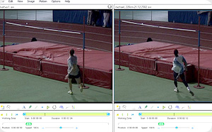
How do people track video and music change over time? It seems harder than pure visual diffing. Sound can only be processed linearly. If the playback rate is fixed across versions, we could play tracks simultaneously and give viewers the power to toggle the salience of each version. In sound that could mean changing the volume, in video that could mean changing transparency. However, this model breaks down if playback rate changes, or “landmarks” in the media stream are moved. Another solution could be to play both videos side by side, but let the user have fine grained control over playback rate. This technique is sometimes used when performing before-and-after sports analysis, using free software such as Kinovea.
Of course, one could also convert these other media into a visual representation (such as a sound spectrogram), or compare the configuration files used to generate the media (such as with animation code), and then apply standard picture change techniques.
I haven’t investigated this further, but Ian mentions the possibility of using optical flow algorithms to guide intelligent collapsing/expansion of time in video playback.
Tracking Text Changes
It is much easier to track changes in text-based files than in binary files, because the “diffs” are more likely to be semantically meaningful. You also gain the full power of git-based visual diffing tools, such as diff2html and the Monaco Editor’s diffing view. For this reason, I prefer keeping notes in text (such as txt or Markdown) over proprietary/binary formats such as Word documents.
Tracking Changes in Essays and Poetry
See Draftback (embedded above), Draftin, and Midst Press for examples.
Tracking Digital Drawing Changes
The iOS Procreate app generates timelapses (via Ian Johnson), which can be found all over Instagram. As they can get long (multiple minutes), they can be paired with narration to make engaging videos (see this Insider video about making splash art ). Add narration to these timelapses a la a Flourish talkie is engaging content even for non-artists to consume.
Tracking Tabular Data Changes

The Qri data versioning application’s cell-level comparison: