This survey post covers background motivations for solving the problem of exploring high dimensional tabular datasets, as well as introduce tools and techniques I’ve encountered for handling them.
It should be considered a jumping-off point when seeking ideas to explore, rather than a collection of quick answers.
How to Select the “Right” Dimensions
It can be difficult to know which dimensions (columns in tabular, or node/edge attributes in network) of a dataset are important, especially during early phases of a project.
Applying summary statistics offers hints, but these techniques are limited in the insights they can reveal. Visual “interestingness” is difficult to quantify, but people know it when they see it. Anscombe’s Quartet is the classic statistics example of how datasets with identical summary statistics can have clearly different visual appearances when displayed on a scatterplot. Autodesk Research expanded on this idea with their paper on the Datasaurus Dozen.

“Same Stats, Different Graphs”
Despite the advantage of graphics in these special situations, summary statistics are still valuable. Unlike pictures, numbers can be used as search criteria and thresholds in alerts, and take up less visual space.
There are efforts to help visual tools fulfill some of those roles. Systems for searching by visual “motif” exist (see Fred Ohman’s mHealth Timeseries Data Dashboard), but are computationally expensive and constrained in the type of motif that can be searched for (summaries of single timeseries). I don’t know of tools that allow searching for a “dinosaur picture” in a dataset. Sparklines (word-sized data graphics) are very space efficient, but are challenging to make without specialized programming or spreadsheet software.
Luckily, it isn’t necessary to pick just graphics or words, since effective data UIs will leverage both techniques.
If you’re reading this blog, you probably already use visuals during data exploration. I’ll save further elaboration on examples of visual analytic approaches for future posts.
Running Out of Visual Variables
The purpose of this section is to highlight that you don’t need to have “big data” to run into problems of high dimensionality. If you’re already convinced this is true, feel free to skip to the next heading.
Any spreadsheet with 4 or more columns has the potential to run into challenges of high dimensionality. In his 1996 paper The Eyes Have It, Professor Ben “information-seeking mantra” Schneiderman placed one, two, and three dimensional datasets into their own categories, but binned everything beyond three into the “multi-dimensional” bucket.
Simply knowing that visualizing might reveal insights doesn’t help with picking dimensions or visual encodings. A frequent challenge in visualization is selecting useful dimensions, and picking the right encodings for them. This process is highly iterative. It is difficult to know the “ideal combination” without actually trying the encodings on actual data, hence the importance of having tools that let users quickly try different encoding strategies. I recommend trying tools in the Vega or Grammar of Graphics (ggplot, plotly, Tableau, etc) families, as they make it easy to transition between encodings.
It doesn’t take many dimensions to exhaust our palette of visual variables when making readable graphics. In problem-solving visualizations (versus data art), we are afforded 2 positional variables (x and y), with a dash of color/opacity, shape, and size for flavor. If we’re feeling ambitious, we might toss in animation for a temporal dimension. A prime example is Hans Rosling showing 5 variables at once in the Gapminder scatterplot. This presentation tracks progress in nation growth through mapping data to 2D position, color, circle area, and time. One could add more visual encodings arbitrarily, but readability quickly deteriorates.
 Jacques Bertin’s Visual Variables
It’s possible to add creative encodings beyond the Bertin basics (see Georgia Lupi and Stefanie Posavec’s work), but those other techniques will not leverage our preattentive visual system. For examples of the different speeds of cognitive tools that people use to decode visualizations, see Professor Steve Franconieri’s OpenVis talk, “Thinking in Data Visualization, Fast and Slow”.
In storytelling, it may be appropriate to use redundant encoding (such as associating temperature with both color and size). Redundancy may make it easier for an audience to understand points the author makes, but it comes at the cost of losing a channel that could have been used by another dimension. This tradeoff between redundancy (to reduce risk of information loss in) and information density is similar to the tradeoffs in data transmission format used to produce error-correcting codes in information science.
For practical tips about picking visual encodings for each of your dimensions, see Dona Wong’s WSJ Guide to Information Graphics.
Given these challenges, one might resign to trying as many dimension subsets as possible using domain heuristics to limit the search space, and hope that an insight is discovered before deadlines arrive. While this is a valid strategy, there are tools that can inspire more targeted approaches.
High Dimensional Data Approaches: Top Suggestions
If you only take 2 things away from this article, I encourage you to try parallel coordinates or a form of dimensionality reduction. You’ll find out more about these techniques in the following sections.
Idea 1: Parallel Coordinates / Parallel Sets
Parallel coordinates are for dimensions that are numeric, whereas parallel sets are for relationships among categorical dimensions. Quantitative dimensions could be incorporate into parallel sets by binning them (like a histogram).
In preparing this article, I was amazed to find this technique is at least 130 years old! It was used as early as 1880 by Harry Gannett, but it’s not seen widely outside of data visualization circles. Part of the problem is that takes some effort to explain, and loses significant usability when presented as a static graphic. It’s creeping closer towards the mainstream due to the addition of interactive features for manipulating the display. This a technique where the power to directly manipulate the visualization is essential to its interpretability.
I find that brushes (the ability to filter along dimensions by dragging a cursor) are critical to the usability of these charts. See here for a non-brushable parallel coordinates to decide for yourself. The ability to reorder the dimensions is also critical. Given the susceptibility of these graphics to end up in a “hairball” state as network graphs often do, filtering is necessary to enable the user to untangle the lines into a useful state.
- Robert Kosara of Tableau Research explains how to interpret this chart type in his blog. Link.
- Tableau users: see here for a tutorial on how to make a parallel coordinates visual.
- Kai Chiang’s Nutrient Explorer is my favorite parallel coordinates implementation. It seems to gain new features every year, including free-text search for filtering the foods. His 2013 OpenVis presentation Exploring Multidimensional Data is all about Parallel Coordinates.
- There was a Semiotic “Parallel Coordinates” example before the Semiotic docs redesign. While that is being restored, React code for a Semiotic-powered parallel coordinates is in the
nteractdata explorer codebase. - The
plotly.expressmodule produces interactive parallel coordinates in 1 line of Python. Below is a GIF of the result in action. It’s the fastest way that I’ve found to produce interactive brushable and reorderable parallel dimension visualizations.
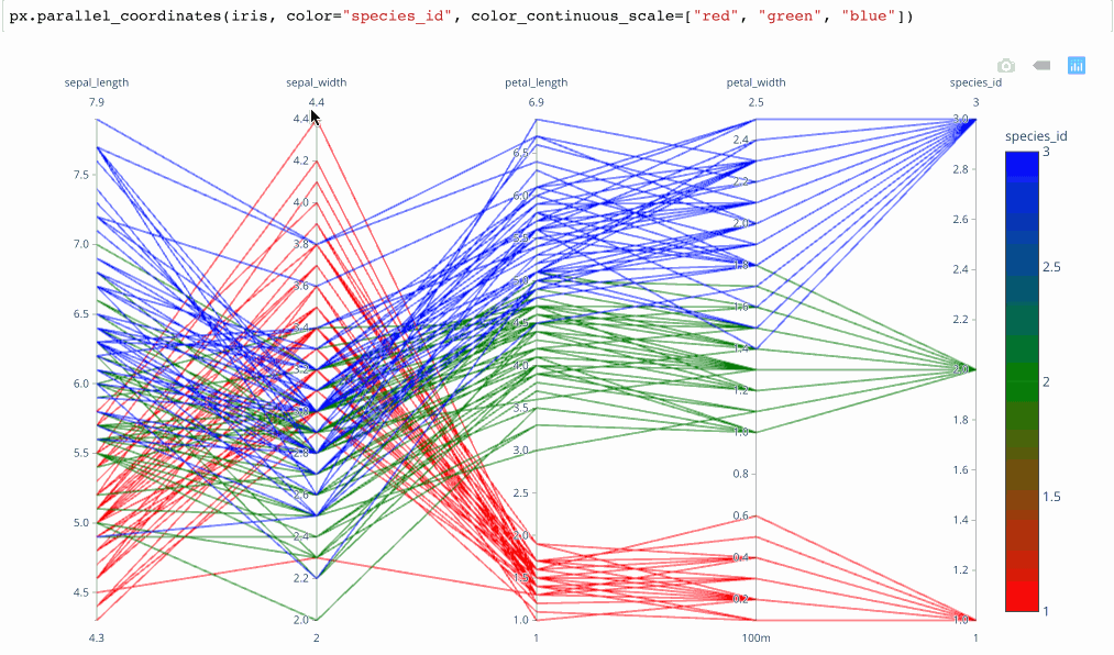 From Plotly.express Launch Article by Nicholas Kruchten
Idea 2: Dimensionality Reduction with Projections: t-SNE, PCA, and beyond
What if you could express thousands of dimensions in terms of a few? In 2008, Maaten and Hinton released a (non-deterministic) technique called t-SNE that helps data scientists do just that. A related technique with a longer history is PCA (Principle Component Analysis, see here for a visual introduction). Delving into the details of these techniques is beyond the scope of this article. All you need to consider is that there are many algorithms for “projecting” high dimensional vectors into lower dimensional spaces.
In these cases, the new dimensions (or principle components) may lose semantic meaning, but we are willing to forego interpretability of individual dimensions if the clusters that emerge from combining these derived dimensions “make sense”. (This is an attitude that one must learn to be comfortable with in order to deploy “black boxes” such as neural nets in decision support software, although machine learning interpretability research is trying to reduce that murkiness). These techniques require that all the dimensions be normalized to the same range, which implies that all the compressed dimensions must be numeric. The normalization process is not straightforward (what should the max and min be?), but it is easier to overcome in datasets with fixed ranges, such as image files (fixed RGB ranges).
Most of these examples will not run properly on mobile or old browsers, so please visit on a desktop in a modern browser.

- The Google Arts and Culture built a t-SNE data explorer to group thousands of artworks by visual similarity. Link / TED Talk.
- To try t-SNE with your own data: Google’s Embedding Projector features several canonical teaching datasets, including Word2Vec, Iris, and MNIST (Handwritten Digits). To use your own data, you’ll need to provide normalized text vectors. Link
- To run this same Embedding Projector from within Tensorflow directly, see this. You can choose between PCA, t-SNE, or your own projection algorithm. See Shenghui Cheng’s slides at the bottom for 6 more projection algorithms.
- Roberto Stelling’s ObservableHQ notebook explains the high dimensionality problem. He explains how t-SNE works through examples of projecting from 3 and 2 dimensions down to 1. This helps with providing intuition about how the projection works, since it’s nearly impossible for people to picture more than 3 spatial dimensions.
- Dan McCarey used the t-SNE and UMAP algorithms to visualize clusters for the DVS Member Signup Challenge. He used a tool called Graphafi, which aims to reduce the barrier for academics in applying this visualization technique to sharing their research data. A head-to-head comparison of t-SNE and UMAP in Immunology context is here.
- To make a t-SNE map without coding, try this tool to build one backed by Google Sheets.
- Mike Bostock has an ObservableHQ Notebook for exploring t-SNE in the browser using tensorflow.js. Link. Another former NYT member, Nick Strayer, explains t-SNE in “plain javascript”. Link
- Professor Ben Schmidt of Northwestern made a stepped visual projection explorer for 13 million books here to showcase his new algorithm (SRP, stable random projection) for making projections from book texts. In addition to being a data exploration tool too, it can also be used as a scrollyteller.
- The Grand Prize Winner of the 2019 World Data Vis Prize was Interacta Studio. They featured a story-driven t-SNE tool that projected ~20 variables about countries down to 2 dimensions. It’s the most mainstream presentation of t-SNE for non-picture data that I’ve encountered. Link
A cautionary note: This 2016 distill.pub interactive delves into the many ways that t-SNE can be misinterpreted, so tread carefully. Other projection methods have their own caveats.
Other Ideas for Handling High Dimensions
I haven’t investigated these approaches as extensively as the others, but they are still worth a mention.
Table Lens
This tool was developed by Ramana Rao in 1994. A video presentation introducing the technique is here.
There are two modern projects that I recently learned of through discussions in the DVS Slack which share a similar line of thinking:
- Carl Manaster’s Datastripes, a standalone web app demo
- John Guerra Gomez’s Navio, a D3 plugin. demo
A non-interactive cousin of this idea is captured in the concept of a “nullity matrix” in data quality checking libraries such as Aleksey Bilogur’s missingno. With missingno, you can rapidly assess correlations in poor data quality on a row, cell, or column basis.

Radar Charts (Spider Chart)

I would be careful about using this technique in a data analysis application, but this form is popular in storytelling/presentation settings.
The usability of radar charts has been hotly debated within the data visualization community for many years. Stephanie Evergreen, Alberto Cairo, Graham Odds, and Stephen Few have all weighed in with enthusiasm that is at best, measured.
Nevertheless, there are occasions where I’ve found them enjoyable and/or appropriate. A small listing is provided below.
- Collegeswimming.com uses them to provide a fingerprint for a swimmer’s overall performance across the 5 main event types.
- The Data Visualization Society logo is a radar chart.
- For the World Government Data Vis Competition, Karol Stopyra used radar charts (select a country here) to visualize 20 variables from each country at once, accompanied by a color-coded radial heatmap.
Small Multiples / Scatterplot Matrices
Plotly.express calls these SPLOMS (Scatterplot Matrices) with linked brushes.
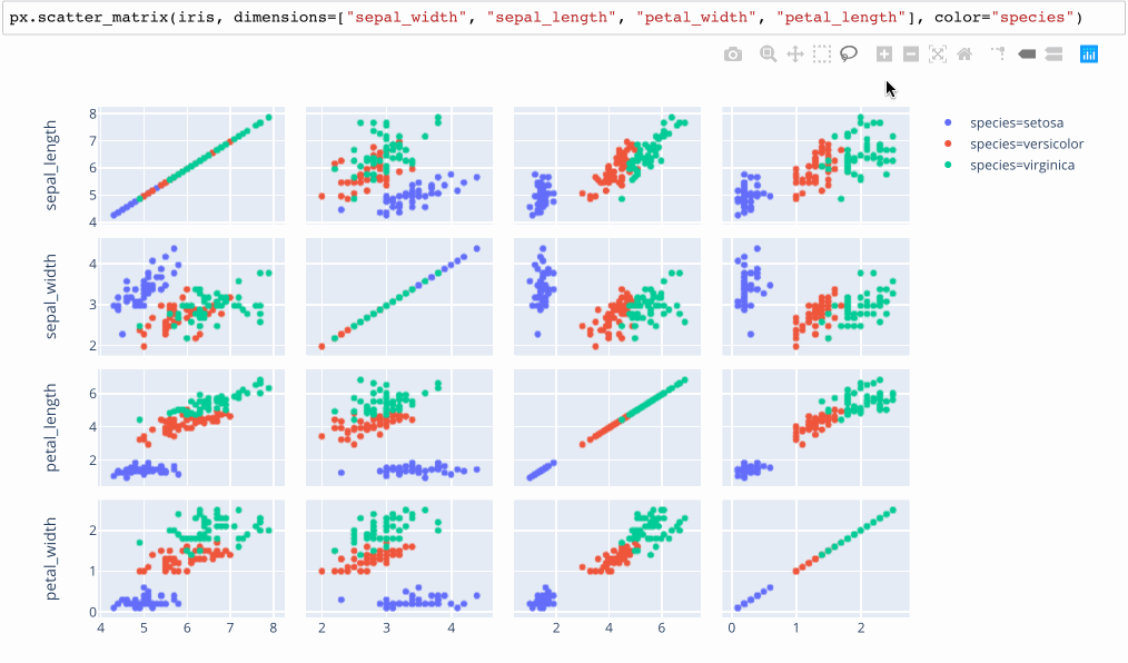
A non-interactive version of this idea is available in the python Seaborn library as a “pairplot”, which overcomes the problem of picking 2 dimensions to plot by trying every possible pairing. While clean, this approach makes it hard to compare more than 2 variables at once.

In general, all sorts of charts can be deployed with the small multiples technique, where each row or column is either ties to a specific bin range with a numerical dimension, or a specific value within a categorical dimension. However, I consider small multiples to extend our capacity more into the “medium” range as each “cell” can get considerably smaller if there are many combinations to test.
Conceptually, there’s nothing stopping us from extending these 2d grids as “cubes” in 3 dimensions. However, interacting with such a chart is considerably less intuitive, as it would be impossible to see across all layers without really smooth interaction controls.
Ideas from the Academia: Data Context Maps
Shenghui Cheng presented a survey of many different ways to “Visualizing Analytics for High Dimensional Data” at ODSC East 2018. While his slides mentioned several of the techniques mentioned above (including parallel coordinates, projection embeddings, pairwise), he also described several experimental techniques that have not been commercialized yet. I found the “Data Context Map” most promising, but he also has slides that touch on his related work for multivariate data visualization such as ColorMap and RadViz.
I’ll highlight the Data Context Map since I found it easiest to interpret. It was motivated by the desire to present high dimensional data in a form that non experts could consume, in a way that overcame the expertise demanded to operate a parallel coordinates chart. The design also aimed to avoid the loss of semantic meaning when viewing clusters achieved by traditional embedding projection algorithms like t-SNE or PCA.
What he proposes is a framework to “fuse the relationships within samples, within attributes, and between samples+attributes”, whereas all the other techniques drop at least one of these comparisons. The resulting “data context maps” have contours that help the user to begin to understand the “shape” of the space that the higher dimensional data are being projected into. His paper goes into the details, using examples from college metrics and the classic MTCars data. If I find the right dataset to motivate having a UI for exploring the data in this way, I might revisit this paper and attempt to implement a version in the browser.
Summary
Visualizing high dimensional data is challenging, but critical during early stages of data analysis. The “ceiling” that marks “high” is surprisingly low (4 plus dimensions), so it’s worth investigating even if the naming of the problem may make it seem like a “big data” issue. It’s worthwhile to invest in learning less popular techniques in this category of visualizations, since this work can inform the selection of dimensions that can be applied to visual forms more familiar to your audience.
Thanks to the generosity of the open source community, there are many packages available for the techniques I’ve tried (parallel dimensions, dimensionality reduction) and for the ones I haven’t.
Reducing the barrier to entry for applying advanced visualization techniques is essential to scaling the beneficial impact of algorithms. Just as someone does not need to understand matrix convolution to apply interesting image filters in Photoshop, I believe that domain experts will eventually be able to visualize high dimensional datasets without touching a line of Javascript.
I’m sure there are techniques or tools that I have missed. Please write on Twitter if you come across further interesting tools, articles, or approaches for making sense of high dimensional data that I can add to this collection.